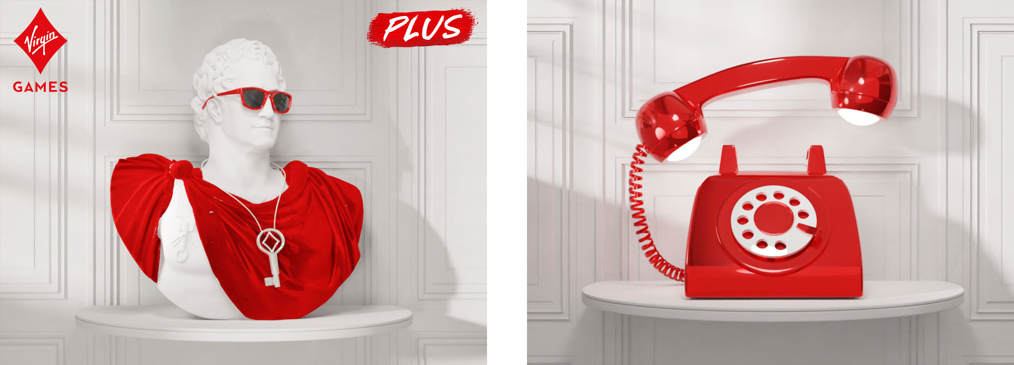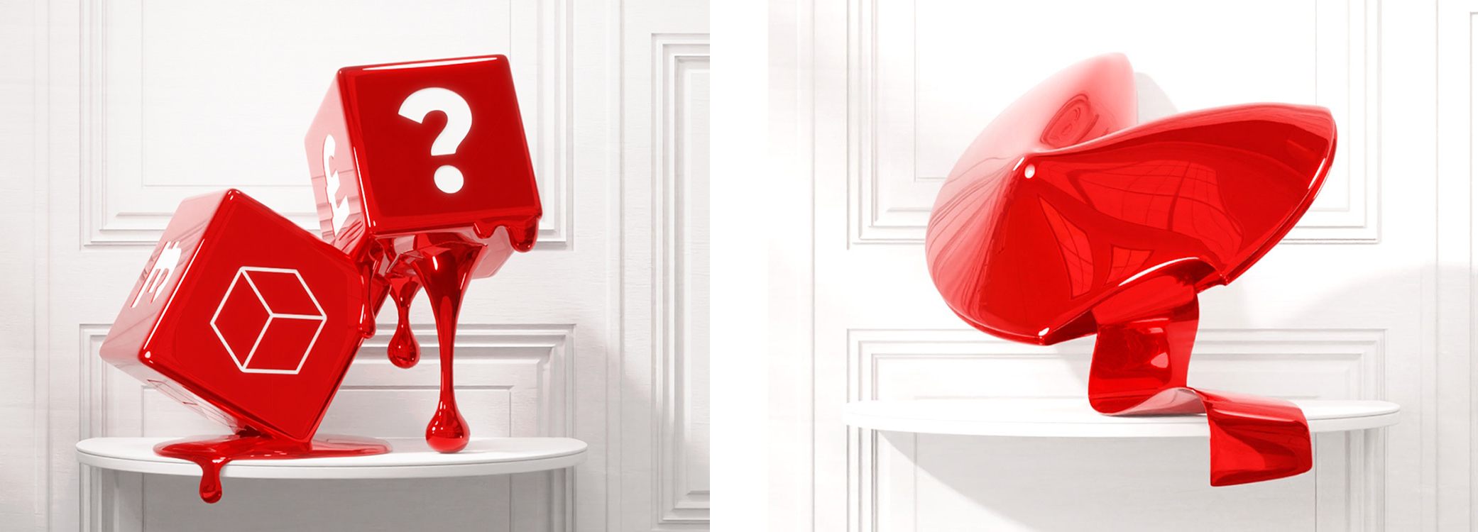
Virgin Games needed a brand refresh that felt both premium and playful, distinctive enough to stand out while flexible across CRM, product, and acquisition channels. As Brand & Design Lead, I defined the visual identity system from the ground up, creating guidelines and scalable marketing templates that unified the brand across every touchpoint.
The concept behind the identity, “The Place to Be,” imagined Virgin Games as an energetic world of discovery, a playful maze of rooms representing different games, promotions and rewards. Each space introduced its own mood and visual expression, all anchored by Virgin’s iconic red.
The identity was later extended to the sister venture Virgin Casino in New Jersey.
Role
Brand & Design Lead (Gamesys / Bally’s Interactive)
Focus
Visual identity development, brand guidelines, design systems, marketing assets including CRM, acquisition, retention and social campaigns
Team
Led the in house designers, collaborated with the marketing and product teams, copywriters and UX/UI designers
Deliverables
Logo system, brand toolkit, landing page and email templates, retention banners, UI mockups, campaign visuals, typography and color schemes
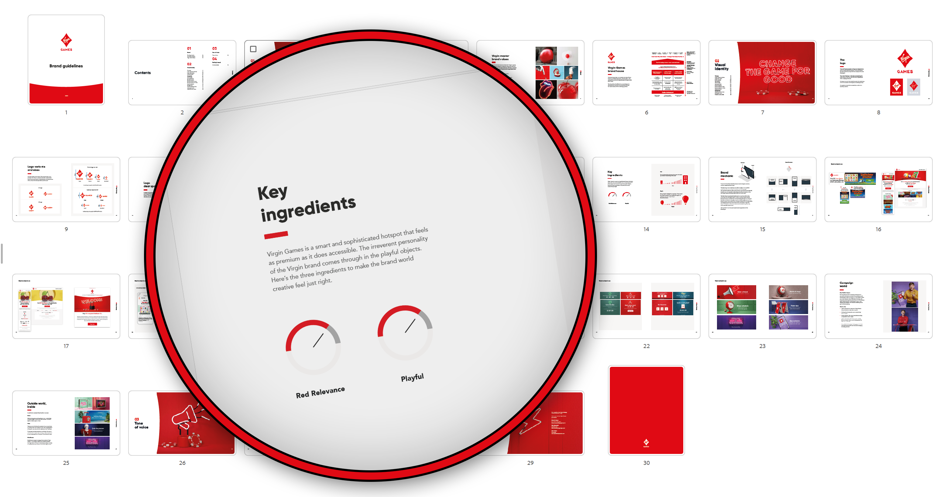
Brand guidelines
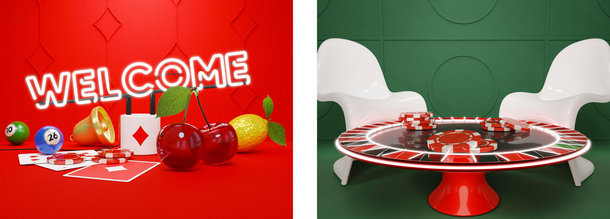
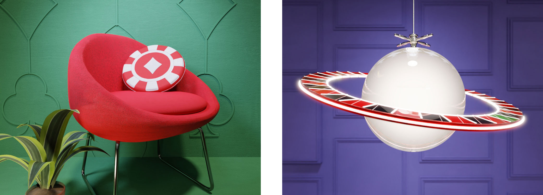
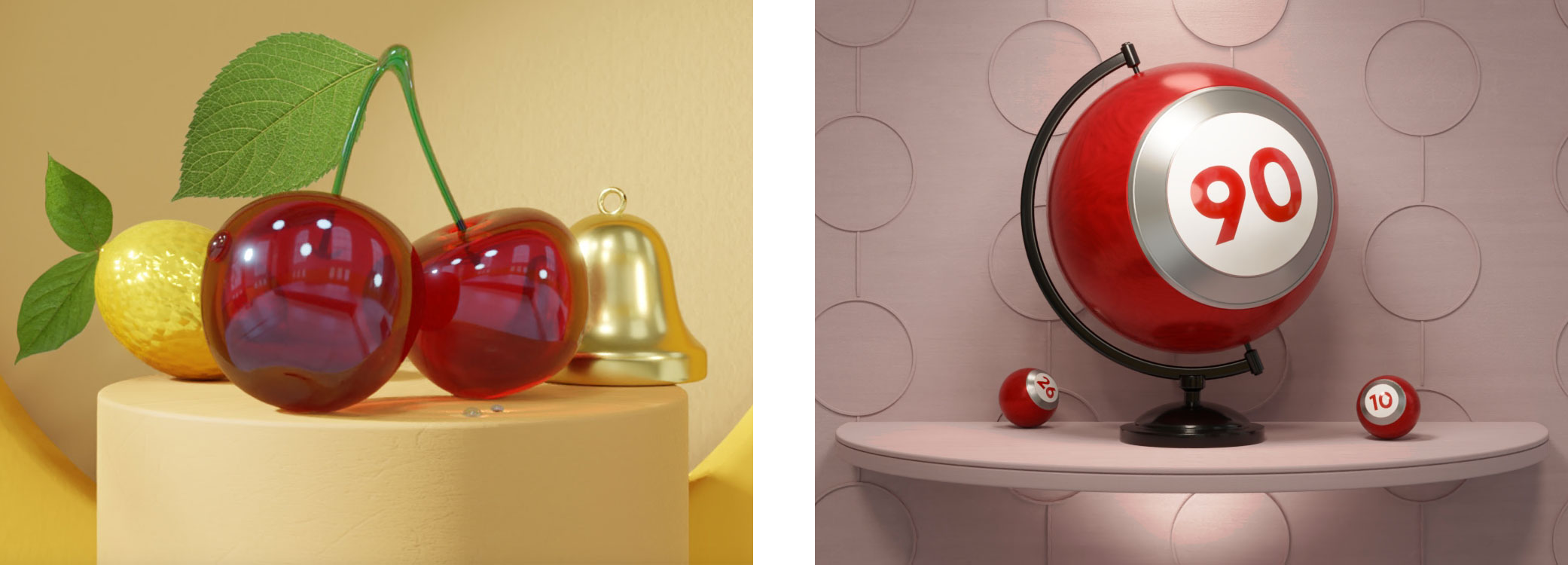
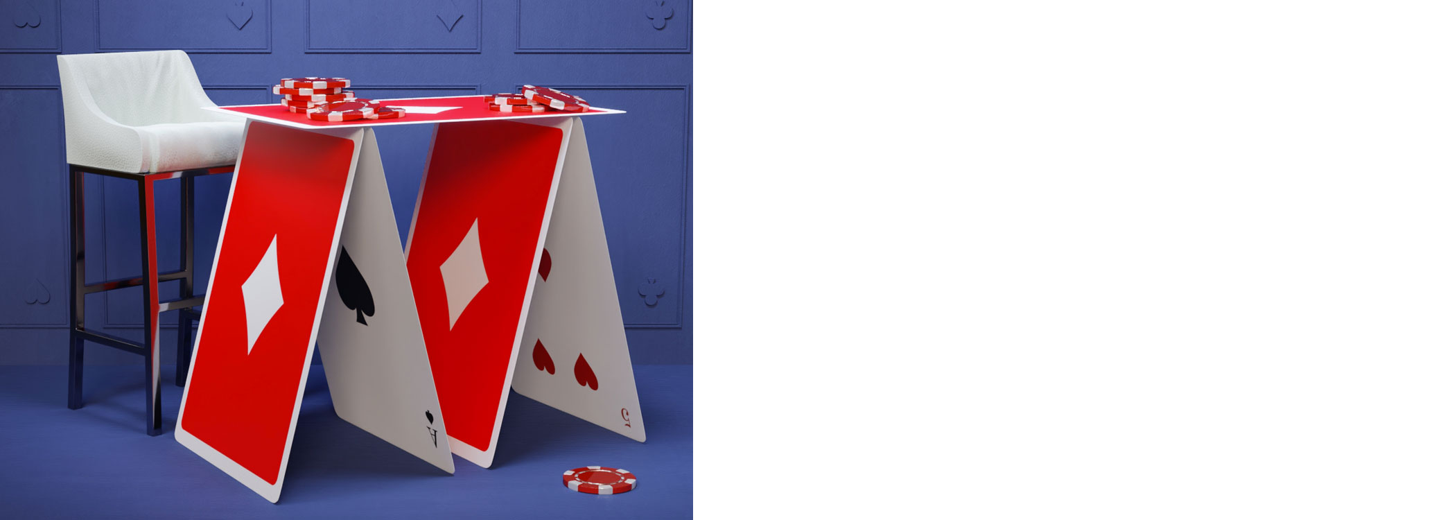
Virgin Games key art examples
Virging Games Plus
At the heart of Virgin Games is the “Plus” scheme, a top-tier, elevated experience crafted exclusively for the most loyal players. The "Plus" identity radiates sophistication and feels like an exclusive VIP pass, using only Virgin’s iconic colors: bold Red, crisp Black, and bright White. This refined palette underscores a sleek, classy aesthetic that sets the tone for a best-in-class experience, making players feel they’ve stepped into an exclusive club. Every element is designed to convey both luxury and inclusivity, creating a world where loyal players are celebrated in true Virgin style.